Sunday, June 17, 2012

Color Throwdown Challenge #196


Here is my card for the Color Throwdown challenge #196 this week. These are the colors we were supposed to use.


I actually used all of the colors but in a very minimal way as you can see. I embossed the flowers here with vanilla embossing powder, used the blue on the ribbon, and the saffron for framing the greeting behind a vanilla paper. And I love the crumb cake paper, it is perfect for so many different types and styles of cards. This is another picture below, of the card from a different angle. Thanks for looking!

Friday, June 15, 2012

Mickey and Minnie Mouse


Here are some cards that I made at a class at Dawn Olchefske's place. I thought they were very clever. This is Mickey and below is Minnie.


Accessories: Circle punches: 1 3/4", 1", small circle and small heart punch, glue dot, stampin' dimensionals

I think these will do quite well for my grandkids birthdays or just a thinking of you card to change it up. They will love them!


Thursday, June 14, 2012


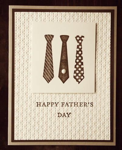
Happy Father's Day! This is the card I am sending to my Dad. I think he will like it.
I made this card in the Buffet Card Class at Dawn Olchefske's house. She comes up with some really cute cards!

Recipe:
Stamps: Best Dad Ever
Inks: Espresso
Paper: White, Espresso, Crumb Cake
Accessories: small brad, square lattice embossing folder

Monday, June 11, 2012

Color Throwdown #195


This is my entry for the Color Throwdown challenge #195.
 I used a set from Stampin' Up! and I think it is called "Tea for Two."
I used barely banana yellow, groovy guava for the peach, pink pirouette, and an aqua blue for the base of the card.  The ribbons are both pink. The cup is also embossed and so is the white background.

Tuesday, May 29, 2012

A Quote I Want to Remember


Art Journal Page 8.5x11 May 29, 2012
This is the first page I've done for the AJC2012series. I have been working on other projects as you know if you read my blog. I am still trying to figure out if this is how I am supposed to do these pages. I guess if it is my "art" I can do what I want. My insecurities hamper my progress all the time, but my desire to create "art" is so strong that I can't let anything stop my progress. What is that saying...."It takes practice, practice, practice, to get better at anything." I know that isn't how it officially goes, but it is close enough. So, I am going to keep on doing these scrapbook/art journal pages and eventually I think I will stop worrying about what they look like and just create them because I have to just do it. Does this make any sense?  

Monday, February 20, 2012

A masculine birthday card


What about this one? I adapted this from a larger card into my 3x3 size. I would suggest this card for a guy. What do you think? I could have used blue as the base in this card or a dark green and I think it would have been just as good.


Recipe:
Stamps: Teeny Tiny Wishes
Inks: Early Espresso (I like this color because it is dark and shows up well like black)
Paper: Vanilla, Espresso, Designer paper
Accessories: Tim Holtz embossing folder (or Ranger), SU punches: word window, modern label and 1/2" circle punch

Friday, February 17, 2012

A card for Mom


I got the idea for this card from another class. Isn't that what classes are for?, to give us more ideas for our creations?  I wish I had a small daisy stamp though, it would have probably looked better. I think this card looks better in real life. The pearls definitely look better in real time which makes the whole card look better. This is still a 3x3 card. I posted the full version on an earlier post here if you want to take a look.


Here is the recipe: (all Stampin' Up!)

Stamps: Pocket Silhouettes, Delicate Doilies, and the greeting is from a discontinued set.
Ink: Early Espresso, Certainly Celery
Paper: Vanilla
Accessories: embossing folder for the middle piece, any flowery embossing folder will do, pearls

Tuesday, February 14, 2012

Cupcake Birthday


happy birthday 3x3 card

I made this card by copying a card I made at a class. I sell these small cards at a cafe that makes cupcakes, along with other scrumptous foods, so I thought these fit well. Hope you like this one...


Here is the recipe: (all Stampin' Up!)

Stamps: Easy Events
Ink:  markers-pink, melon mambo, wild wasabi, black, or use anything close to these colors
Paper: white, melon mambo
Accessories: rhinestone, glue stick, glitter, small flower punch, glue dots

Wednesday, January 25, 2012

Another Birthday Card


Happy Birthday


Another simple card, appropriate for a father, son or male friend. I'm not sure on the green colored paper but it goes with the SU Designer paper. There are two gold brads on the right side of the greeting. The Happy Birthday piece is popped up on dimensionals. This would be easy to duplicate in different colors and different embellishments. Make it more feminine and give to a female. Enjoy!


Monday, January 23, 2012

A Valentine


Be my Valentine

A simple valentine card.
The base is white, the ink color is red. The stamp is from the Extreme Elements set from SU. The large heart is punched out and the edges sponged with a brown ink. The small red heart is punched out of red textured paper. There is a twine bow and a rhinestone glued on the red heart.


Again, the inside decoration adds so much to the card. I have to do this more often. (This card was also made at the buffet card class that Dawn Olchefske offers once a month at her home. )

Friday, January 20, 2012

A Mother's Day Card

For my wonderful mother

The card next to the base is embossed with the embossing folder, tulips, I think. The base is stamped with the doily background stamp, the flower stamp and the greeting. There are the three pearls at the top right on the card. The base is vanilla. I think this is a very pretty card for Mother's Day and it was pretty simple.

Wednesday, January 18, 2012

Get Well


Get Well Soon

I like this card, again it is simple but it is different too. I used the embossing folder from SU to make the oval, then sponged some brown color on the raised portion. Before that I stamped the flowers on the base. I colored the stamp with markers and stamped twice. After finishing the oval sponging I stamped the get well on a piece of off-white or vanilla paper and then used the large oval punch to punch it out. I stuck the get well oval over the base oval. The ribbon is the quilted cherry cobbler.

Inside the card. I stamped the image a little to low so you have to watch that, but I like the look of it. The stamp is from the Holiday Mini catalog from SU, a valentine set. I hope they put it in the new catalog this year.

Monday, January 16, 2012

You Rock!


Happy Birthday!

This is a great card for a teenage boy. I used pacific point, more mustard, and white. This is another card I made at a class. I love the texture and all the cool added elements that are just paper! (stamped circles)

Another simple cool card!

Friday, January 13, 2012

So Simple You Will Love it!


Happy Birthday


This card is so simple you can make a ton of them. It would be great with some more masculine paper for a guy or son. It uses the kraft paper with soft suede paper and ribbon. The patterned paper is designer paper from SU and it is in strips glued on top of each other. I like the added paper design inside the card. 

Wednesday, January 11, 2012

A Birthday Card


Celebrate Today

I made this card at a class given by my friend and former upline in Stampin' Up!, Dawn Olchefske. She has a card buffet class once a month. I go to this class and get to make 8 cards for the class fee. Extra cards are available to make if you want to purchase extras. It is fun and I like getting to choose what cards I want to make. My friend Kathy and I go together so it is also a "girls night out."  I am not quite sure on all the recipe ingredients but I can give you some ideas:
I believe the blue is pacific point, the designer paper is from SU, the ribbon is the new quilted ribbon in the Holiday Mini. The base is white. I think the red is cherry cobbler. Enjoy!